The Redesign Disaster I Almost Paid For
We were six weeks from launch when the design lead raised a red flag: the onboarding flow felt clunky, the dashboard layout didn’t match the new brand language, and the team projected a $250k UI overhaul that would push the release back six months. The stakeholders—engineers, marketers, even a few investors—were convinced the existing flow was intuitive because it matched the wireframes we’d shipped two sprints ago. Yet my gut told me we were chasing a phantom problem, a classic late‑stage pivot that eats runway without delivering value.
Compounding the pressure, user surveys had started to surface complaints about “confusing steps” and “missing confirmations.” The data was vague, the pain points were scattered, and the proposed solution was a massive redesign that would require re‑writing front‑end code, re‑training the support team, and re‑creating marketing assets. I knew we needed a faster way to validate whether the redesign was truly necessary.
Why a 30‑Second Storyboard Beats Endless Wireframes
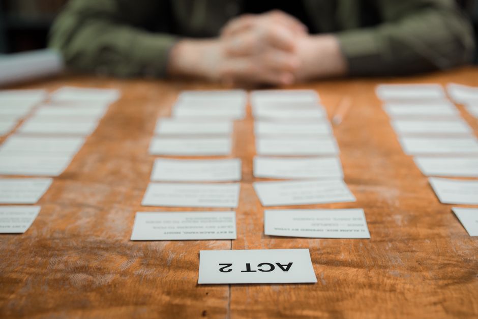
In film, a storyboard is a rapid visual script that lets directors see the story before the camera rolls. I applied that same principle to product design. A storyboard forces you to think in user moments—trigger, action, outcome—rather than isolated screens. When you lay out a sequence of three to five frames, friction points appear as visual gaps that static wireframes hide.
The 30‑second limit is the secret sauce. It forces the team to strip away decorative details and focus on the core value proposition. If you can’t explain the flow in half a minute, you probably haven’t nailed the essential user experience.
Step‑by‑Step: Building the One‑Minute Visual Blueprint
- Sketch three frames. Use stick figures, icons, or simple boxes to represent the trigger (e.g., user clicks “Create Account”), the action (fills out the form), and the outcome (receives a welcome email). No need for polished UI; the goal is clarity.
- Narrate each frame aloud. Time yourself. The whole story should be under 30 seconds. The narration reveals whether the sequence feels natural or forced.
- Iterate instantly. Swap a frame, adjust the wording, or reorder steps, then retest the timing. The visual changes happen in minutes, not days.
We ran this exercise in a 30‑minute stand‑up. The product designer acted as the “visual storyteller,” a role I borrowed from my filmmaking days. The rest of the team acted as the audience, asking “What’s missing?” and “Where does the user get stuck?”
How the Storyboard Revealed Hidden User Flows and Cost Traps
- The storyboard exposed a missing confirmation step after a user submitted a payment. Without it, duplicate orders slipped through, inflating support tickets and churn.
- It highlighted a navigation dead‑end: after completing a trial signup, users landed on a blank page because the “Next Steps” button was never wired. Fixing that would have required a full UI rebuild of the post‑signup flow.
- By visualizing the flow, we cut three weeks of dev time and saved roughly $120k. The team redirected that budget to building a referral program that drove a 15% lift in activation.
The storyboard didn’t just save money; it gave us a shared mental model. Everyone could see the same story, argue about the same moments, and converge on a solution without endless debate over pixel‑perfect mockups.
Embedding Storyboarding into Your Product Process
- Make storyboarding a mandatory checkpoint before any design sprint. If the 30‑second narrative fails, you revisit the problem before you write any code.
- Assign a “visual storyteller.” This is often a product designer with a filmmaking mindset, but it can be anyone comfortable sketching quickly and narrating the flow.
- Archive each storyboard in your product docs—ideally in a shared folder linked to the corresponding epic. During retrospectives, you can trace decisions back to the original visual narrative.
Since institutionalizing the practice, our team has avoided two major redesigns that would have each cost six figures. The habit also speeds up discovery: new features now start with a 30‑second storyboard, then move to rapid prototyping only if the story holds up.





Leave a Reply